YouTube Shorts Tab in YouTube App
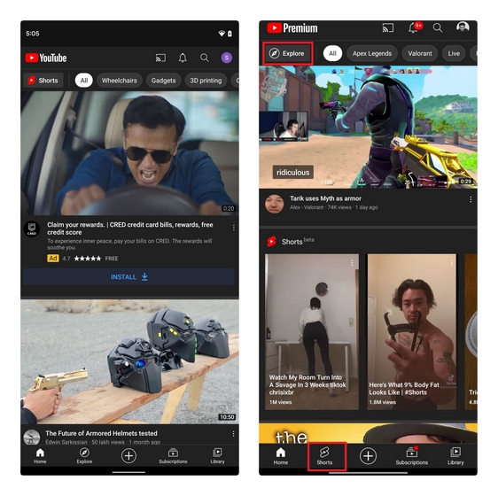
To put things in perspective, here is a comparison between the current YouTube app’s home page and the upcoming redesign that should probably roll out soon. As seen in the image below, the Explore section is given less prominence in the test version. YouTube has shifted the Explore section to the top-left corner of the app, right where Shorts currently exists. Current YouTube Home (left) vs New YouTube Design Test (right) YouTube’s decision to move the Shorts tab to the bottom navigation bar doesn’t come as a surprise, considering how much momentum short video apps like TikTok have gained lately. However, what I don’t like about the new implementation is that the Shorts section continues to show up on the home page despite having a dedicated tab in the navbar. The idea of pushing Shorts through YouTube’s home page even after giving it a prominent spot in the YouTube app feels like the company is trying too hard, at least in my opinion. As of writing this article, YouTube has not widely rolled out the new Shorts tab just yet. However, we could expect it to happen over the coming weeks. If you’re a creator, now will be a great time to go through our list of YouTube Shorts tips to leverage the upcoming boost in user activity and engagement.
