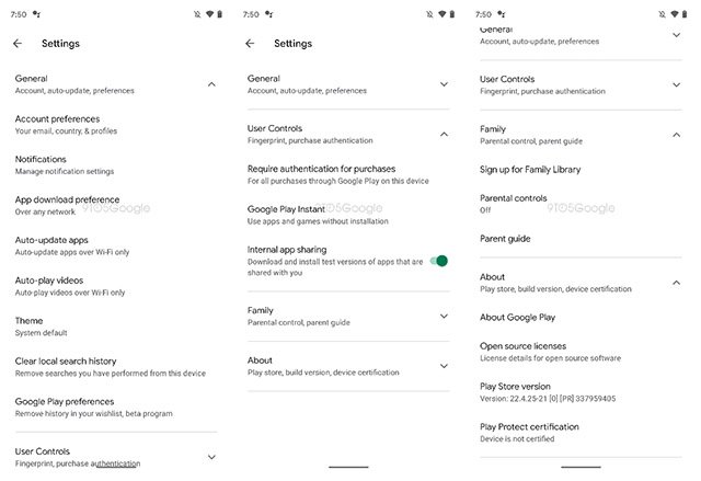
Spotted by 9to5Google in an APK teardown, Google’s latest redesign appears to be limited to the Settings page itself, and seems to be trying to simplify the absolutely bonkers number of settings and toggles the app throws in your face when you head into settings. With the new design, the settings page within the Play Store looks more manageable. Settings are now collapsed under categories such as “General”, “User Controls”, and “About” along with a handy chevron marker on the side to let users know that they can expand the list. When expanded, these expose their individual settings. Also, according to 9to5Google, users can expand one, or multiple categories at the same time. Image: 9to5Google While the new design offers the obvious advantage of reducing information overload when a user opens the settings page within the Play Store, it also makes more space for more settings to be brought into the mix. As pointed out by 9to5Google, the “Family” settings category is available in the main Settings page with this redesign. The redesign isn’t being tested on the user-side yet, and we don’t know when or if Google will roll this out or A/B test it with users on Android. That said, it does look like a cleaner way to display settings and I hope Google rolls this out soon.
