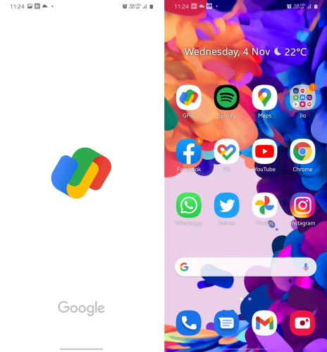
The Google Pay app (formerly known as Tez and popularly called GPay) in India has been spotted with a colorful new logo by Twitter user Sumanta Das. The new logo is currently live only for a select few users. But, the primary question is – why the new logo and what does it signify? The existing Google Pay logo includes the ‘G’ and ‘Pay’ from the name, as shown in the image above. It is only the Google logo that is multi-colored here. The new logo, on the other hand, doesn’t seem to represent the payment app itself. If we were to make any sense of the new logo, I would say the blue and yellow ‘u’ half represents the ‘G’ and the green and red ‘inverted u’ half represents the ‘P’ in the Google Pay name. You just need to add a straight line in the middle to complete the letters.
The new Google Pay logo is in line with the company’s new design and color scheme for its products. It is minimalistic and representative of its identity. Long-time G Pay users will not be happy with the change though. It will take some time to get used to the new colored Google logos instead of the more stylized ones from before. The new Google Pay logo is not available for anyone in the Beebom team. There is no pending update and the Play Store listing is yet to be updated as well. So, keep an eye out as this might be a phased server-side rollout. Google is yet to make an official statement and switch to the new logo on its social profiles as well. Featured Image Courtesy: Twitter/ Sumanta Das
